

REVISING AN EXISTING DESIGNInspire Brands
A UX/UI audit of a QSR mobile app — uncovering usability failures and delivering a hi-fidelity redesign with targeted improvements.
ROLEDesign & Research
TIMELINE2 Weeks
DELIVERABLEHi-Fidelity Prototype
Overview
Inspire Brands is a multi-brand restaurant company with household names under its umbrella. When Jimmy John's launched its first Canadian location, a standalone app was released to support it. Inspire Brands engaged our team to evaluate the app and identify opportunities to improve the experience for Canadian customers.
Working alongside a UX strategist, I led the design portion of a two-week sprint — auditing the existing app, analyzing the competitive landscape, and delivering a hi-fidelity prototype demonstrating key improvements. Scalability was a core consideration from the start: not just as Jimmy John's grows in Canada, but in terms of white-labeling the framework across other Inspire Brands.
Process
01
Heuristic Evaluation
Evaluated the app against Nielsen's usability heuristics, documenting specific issues with examples.
02
Competitive Analysis
Reviewed leading QSR apps to identify established patterns, UI conventions, and interaction models to inform the redesign.
03
Hi-Fi Redesign
Translated research findings into a Figma prototype — addressing critical issues while modernizing the visual design.
Key Findings
Of the 10 heuristics evaluated, four areas scored poorly enough to directly impact user trust and task completion. Several accessibility violations were also noted.
01
User Control & Freedom
Editing a cart item was hit or miss — switching sandwich size or bread type often forced users to start customization over from scratch. Changing from delivery to pickup mid-cart required navigating through multiple screens.
02
Aesthetic & Minimalist Design
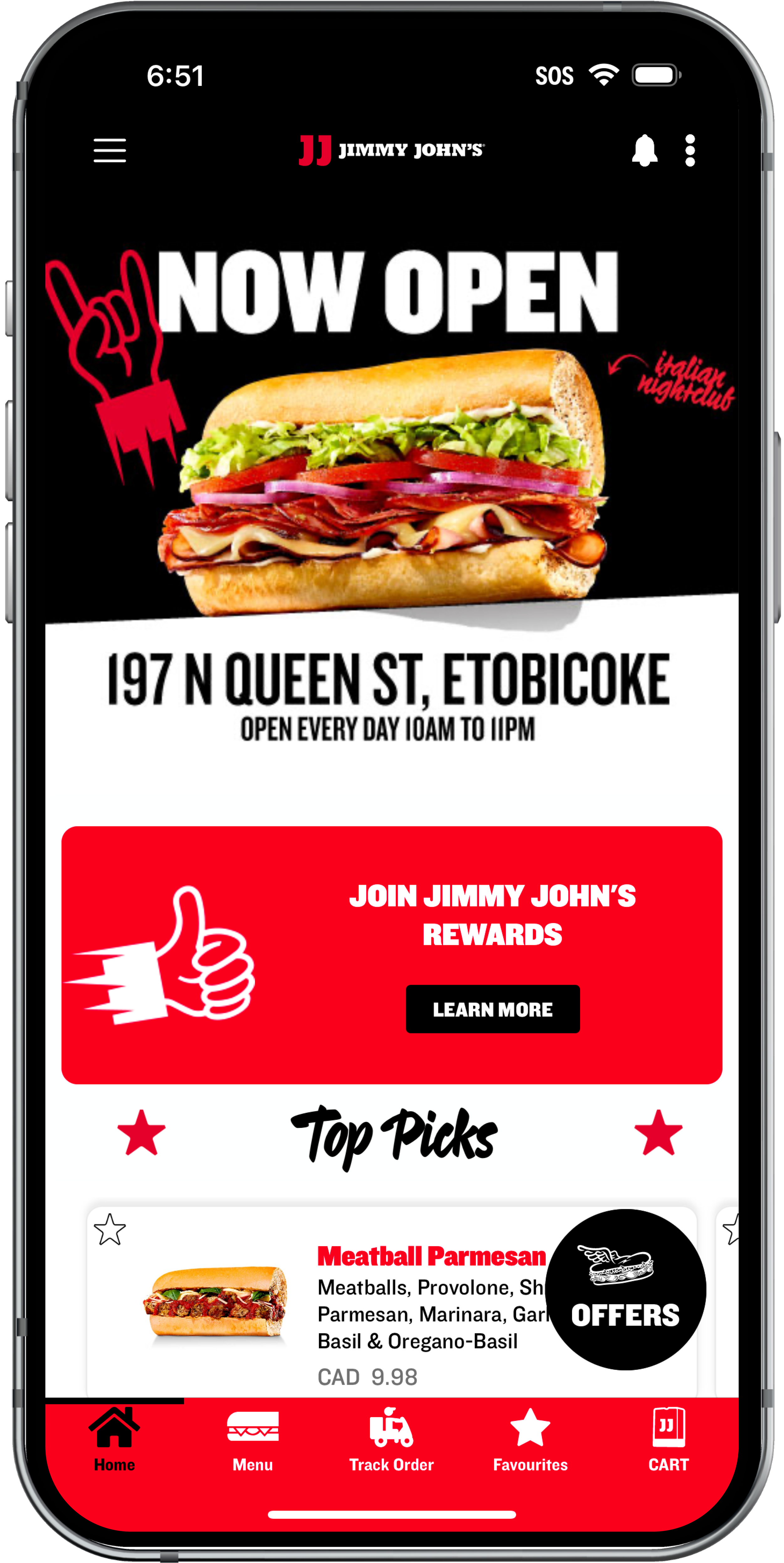
The interface was visually heavy with competing red elements, dense typography, and low-contrast patterns. Key actions were hard to distinguish at a glance, and accessibility issues around color contrast and touch targets compounded the problem.
03
Error Prevention
Tap targets were too small throughout the app. The date/time pickers had erratic behavior, scrolling to unexpected hours and displaying errors only after a selection was made — not before.
04
Accessibility
Several WCAG violations were identified throughout the app. The bottom navigation failed color contrast requirements for selected states, tap targets were consistently undersized across interactive elements, and the date/time pickers lacked sufficient error feedback — creating barriers for users relying on assistive technology.
Before & After
Following the patterns identified through competitive analysis, four primary screens were redesigned to address the most critical usability and visual issues identified in the audit.
These screens were then prototyped to demonstrate a basic order flow.

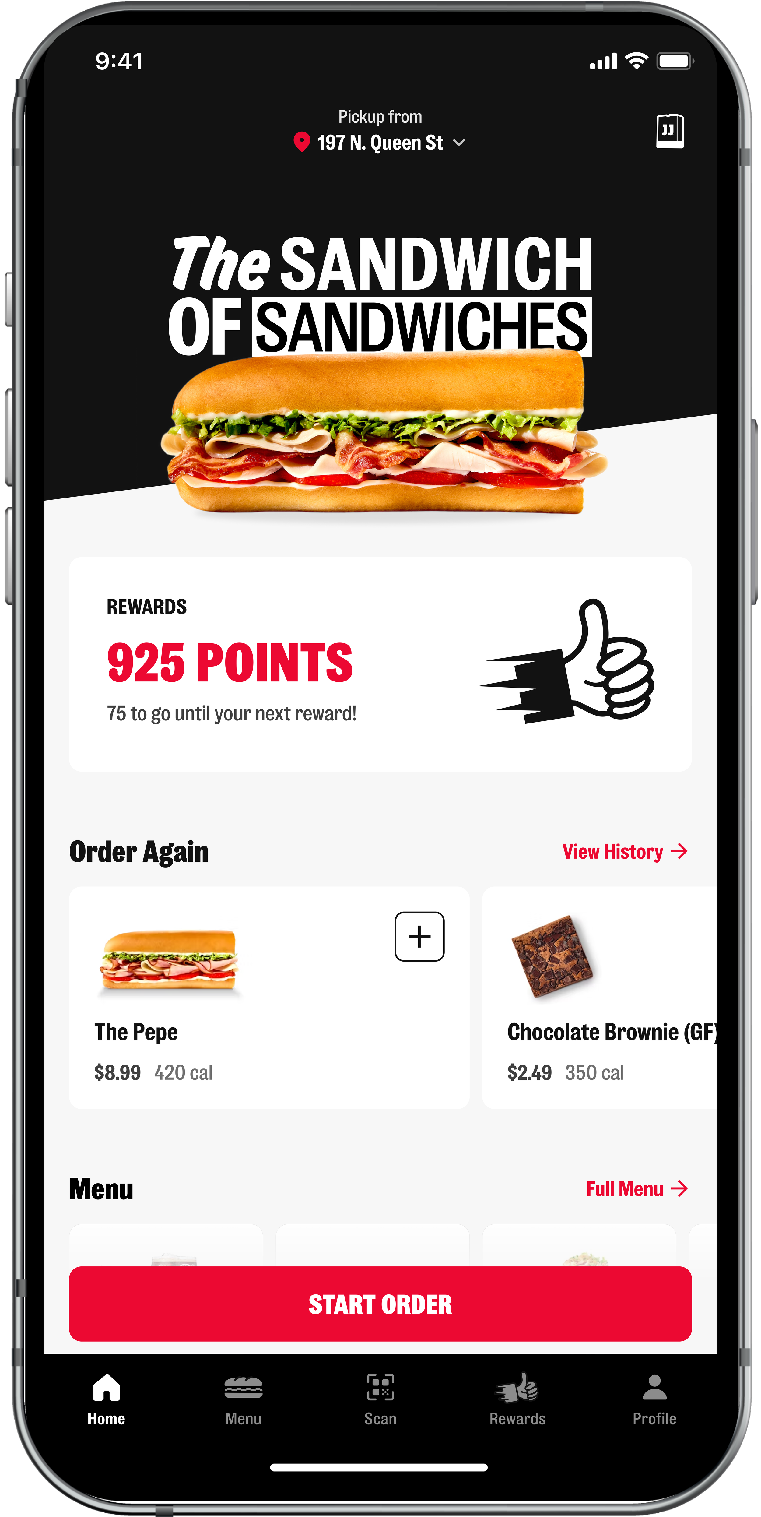
Home
Simplified the header and bottom navigation to essential elements, following common patterns that match user expectations and reduce cognitive overload.
Added a persistent location selector so users can see their current ordering method and location at a glance — and easily switch between pickup and delivery without leaving the screen.
Rewards are prominently surfaced without dominating the page. Returning users see an 'Order Again' section for quick reordering, followed by new and featured items — a pattern validated by competitive research.
Red is used strategically and sparingly — reserved only for calls to action and selected states. This keeps the brand's bold personality intact while ensuring users' attention is directed where it matters most.
BEFORE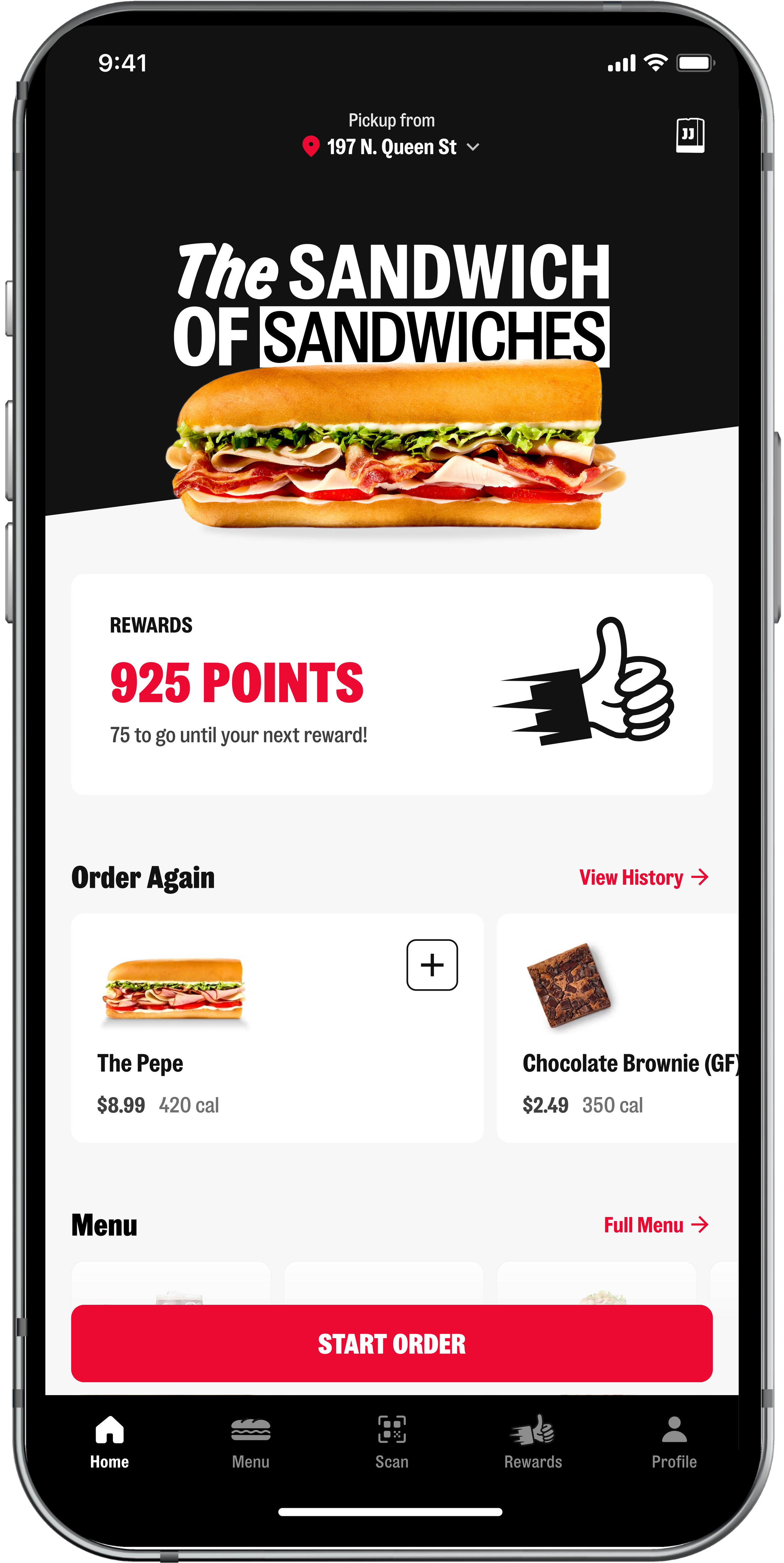
AFTER
Menu
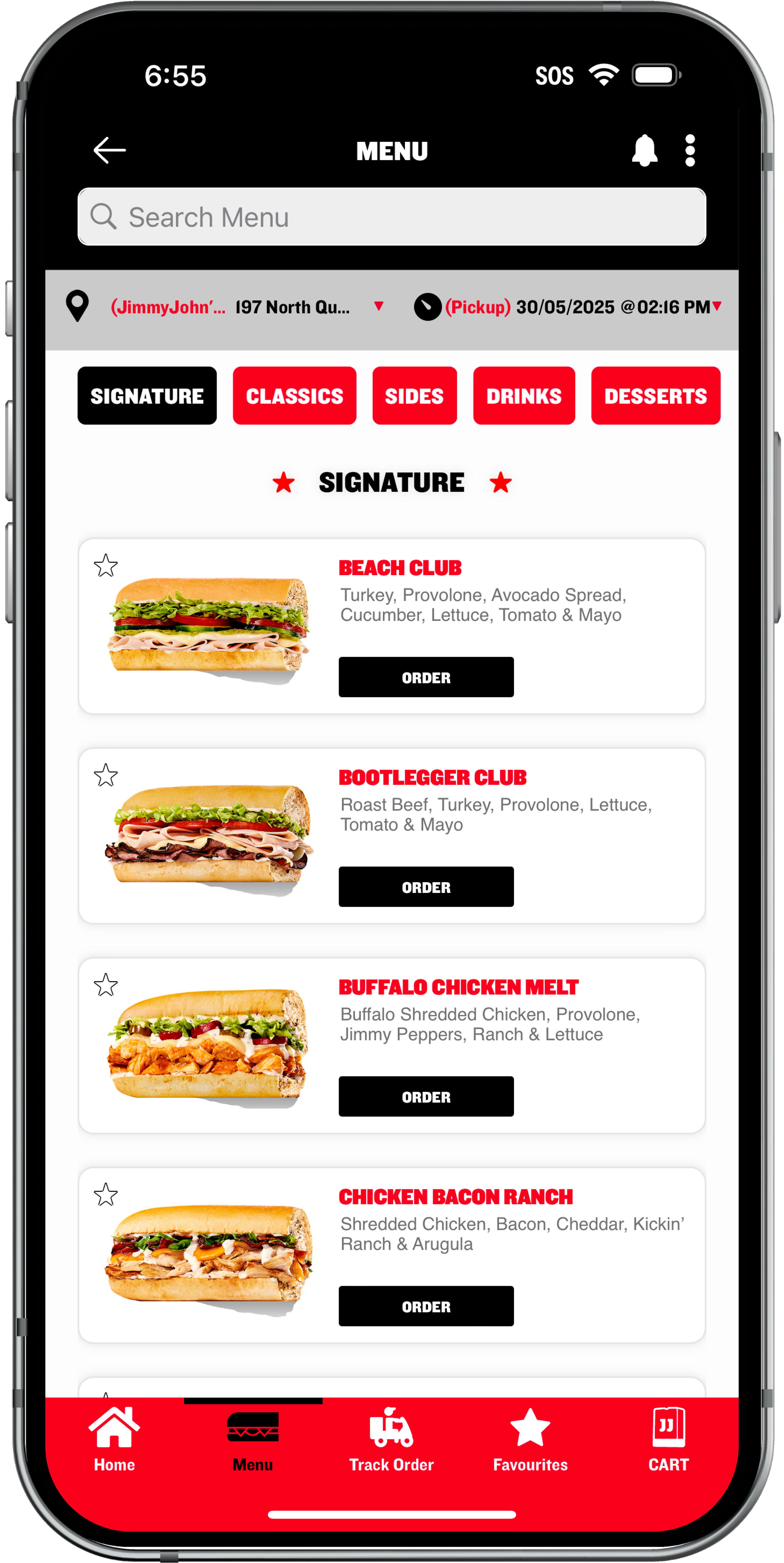
Replaced a flat, scrolling list with high-level category cards (e.g. a single 'Sandwiches' card) that expand into subcategories — reducing the number of taps needed to find an item.
Within a category, tab navigation allows users who know what they're looking for to jump directly there, while users who are less familiar can simply scroll through everything.
This structure also scales well — Jimmy John’s staples like Little Johns or The Gargantuan can be added without restructuring the whole menu.
BEFORE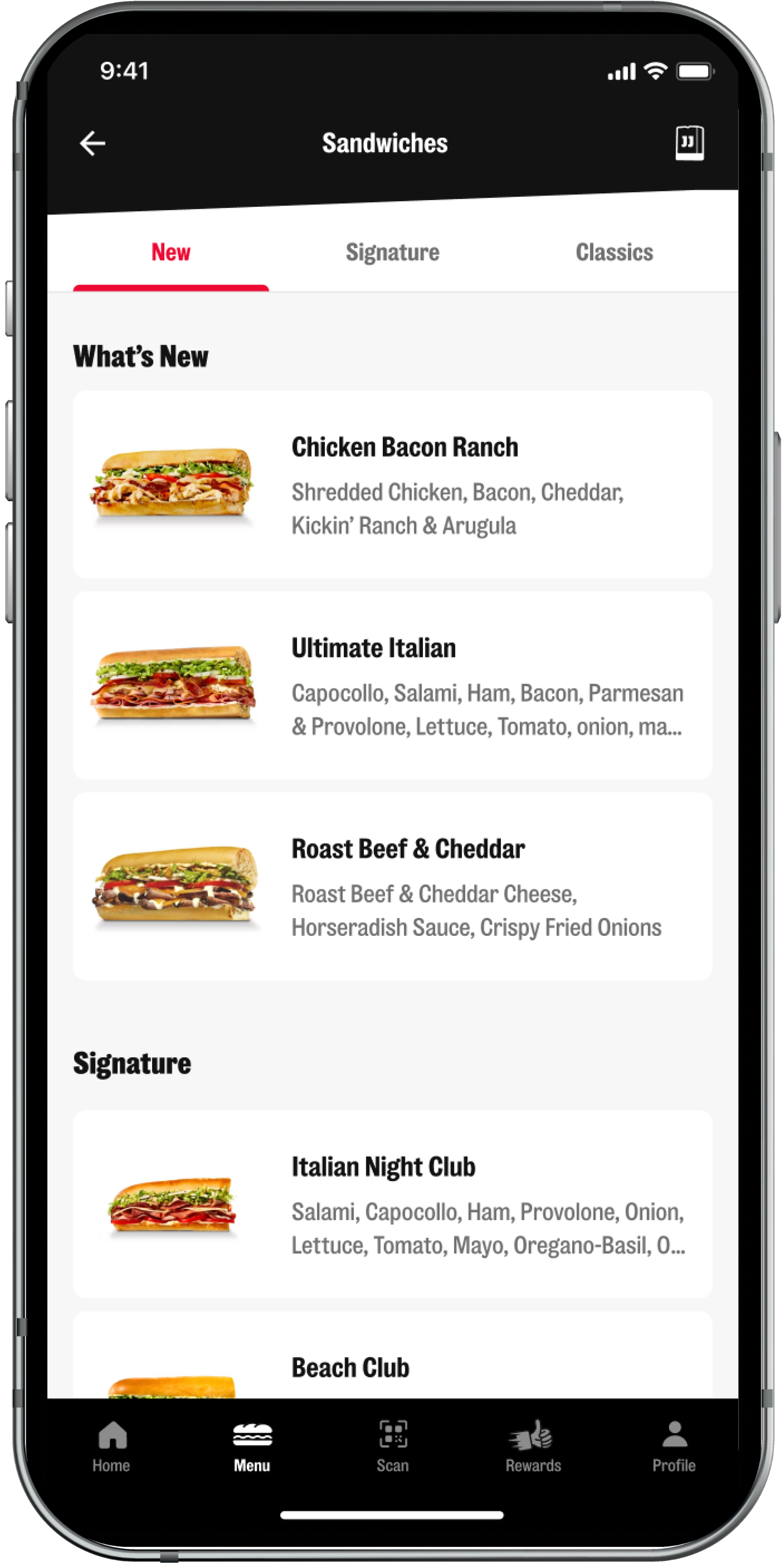
AFTER
Product Detail Page
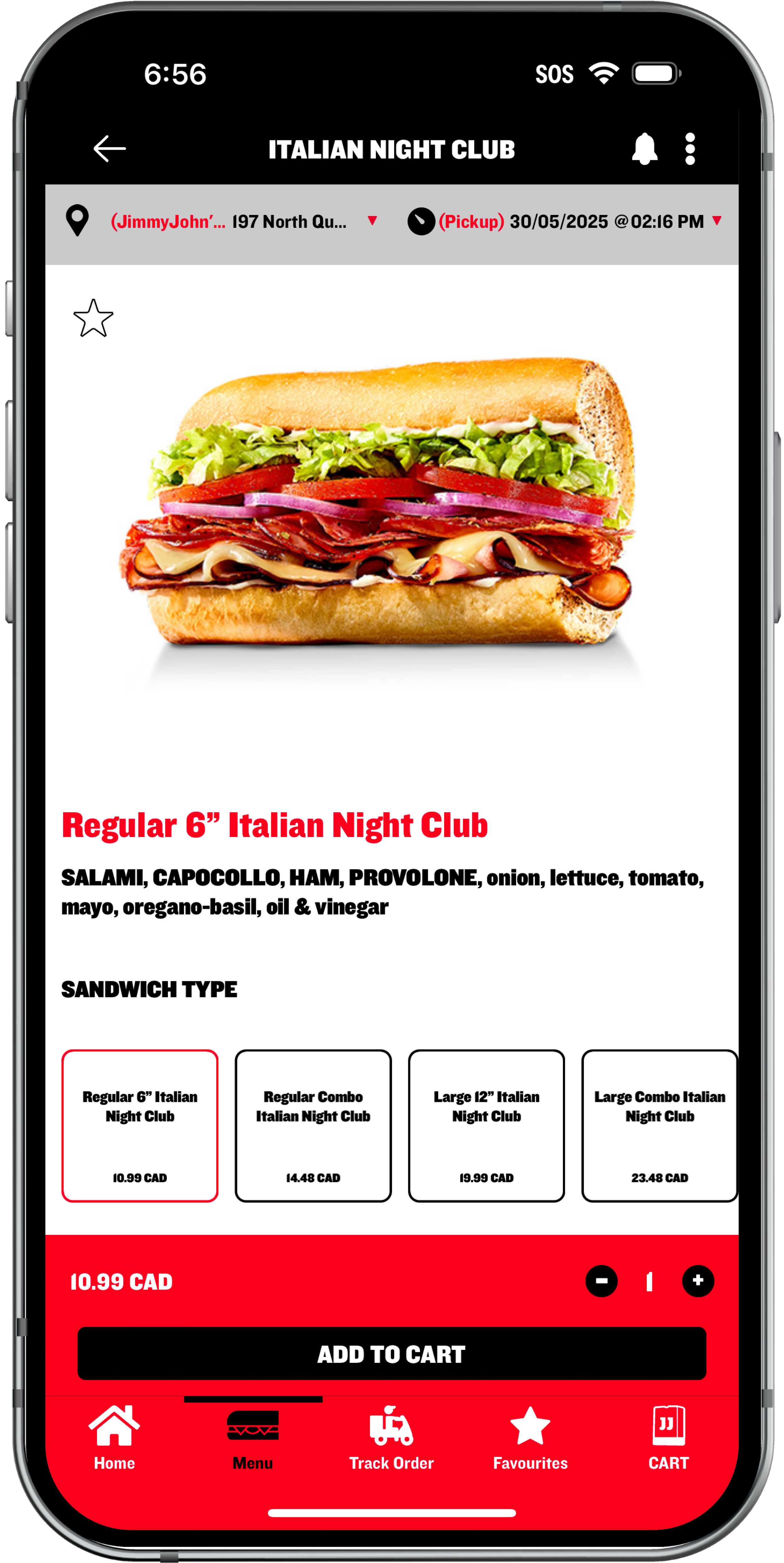
Reworked the information architecture to walk users through one decision at a time: first size, then bread, then toppings.
Bread options dynamically reflect what's available for the chosen size — for example, French bread is the only available option when a Large size is selected and ‘Toasted’ is hidden when an ‘Unwich’ is selected (no warm soggy lettuce wraps, please!)
Toppings are regrouped by ingredient type (proteins, cheeses, veggies, sauces) rather than by included vs. add-on status. Included ingredients are pre-selected, with the ability to adjust quantity or remove entirely with a single tap. Price and calorie counts update in real time with each selection.
BEFORE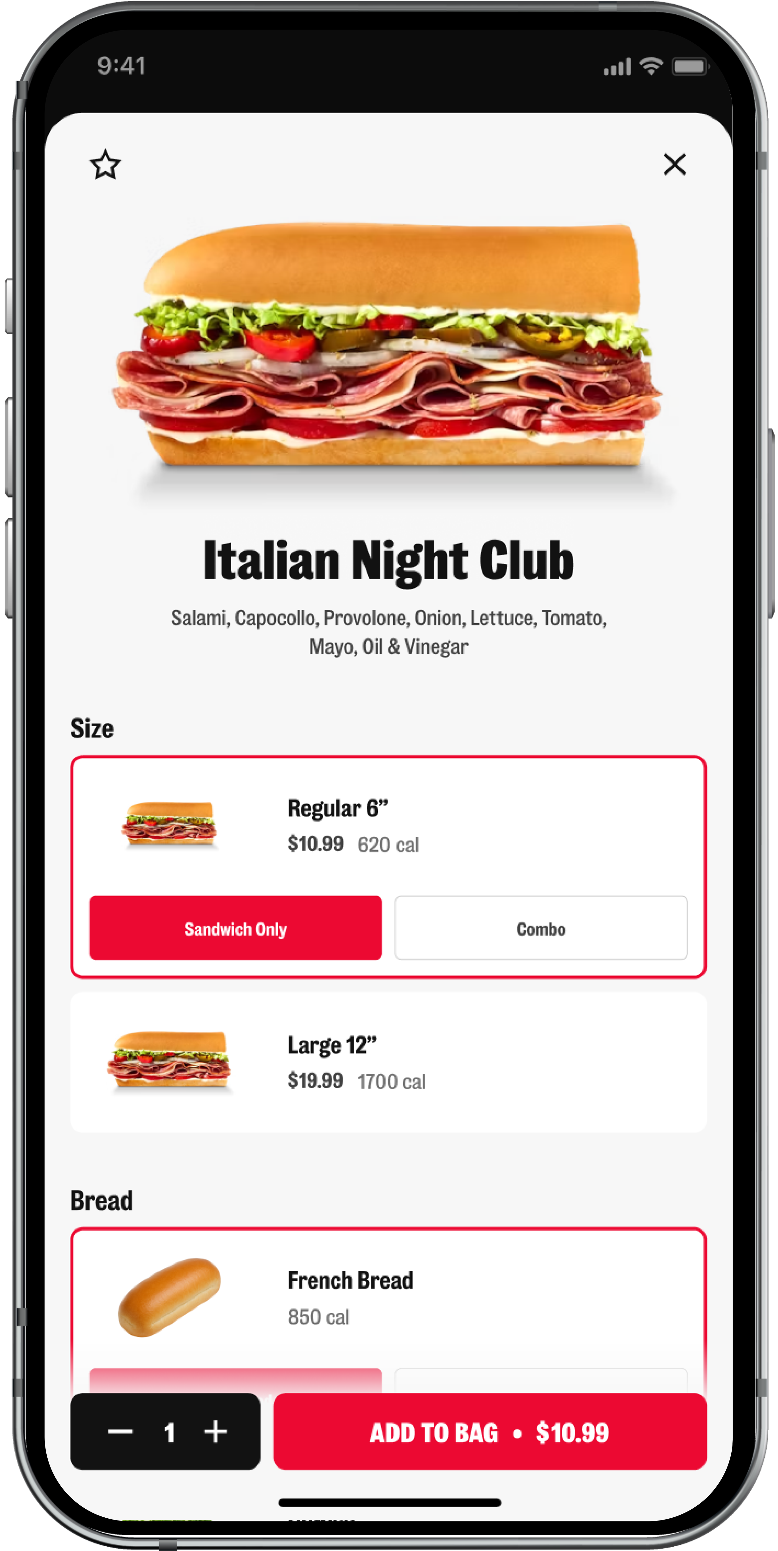
AFTER
Bag
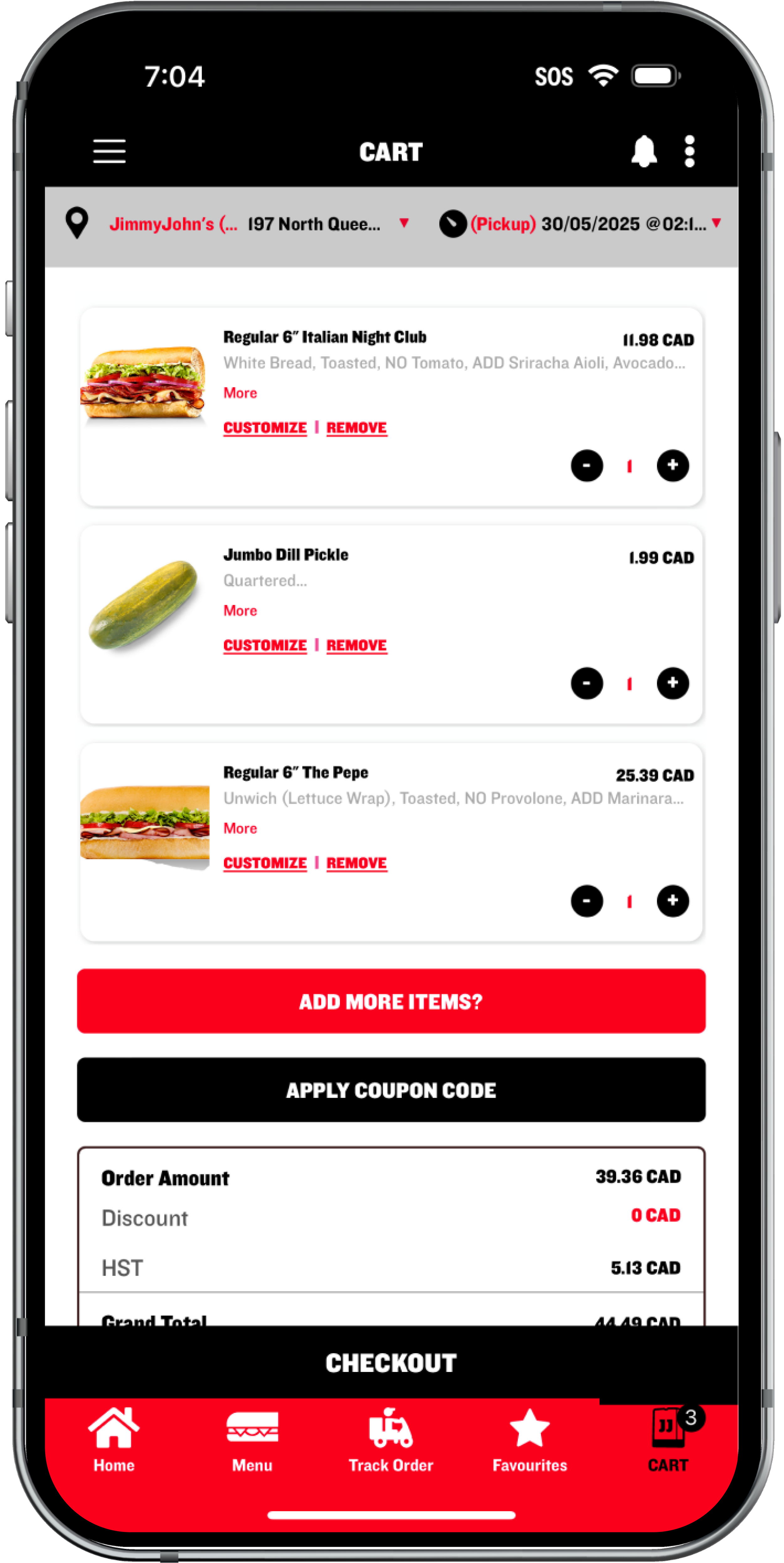
Redesigned the cart with clear visual hierarchy and significantly more white space — making it easy to scan order details and take action before checking out.
Order details (pickup location, timing, payment method) are surfaced at the top for quick review. An inline quantity stepper replaces the previous text-link controls.
A non-intrusive combo upsell nudges users to upgrade without blocking the screen — it appears briefly and dismisses on its own, respecting the user's flow rather than interrupting it.
BEFORE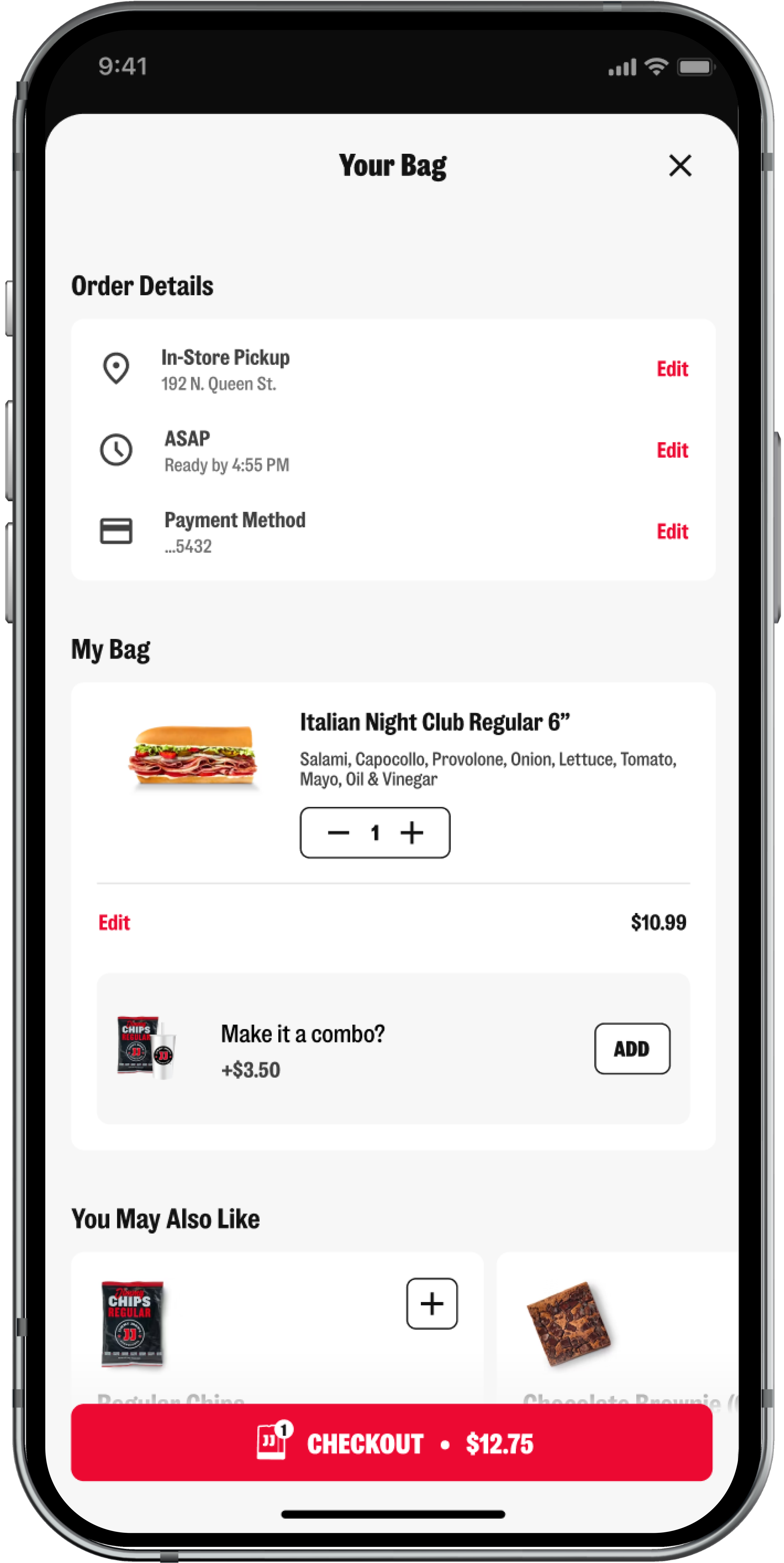
AFTERScalability & White-Labeling
A key requirement for Inspire Brands was that this design framework could scale — both as Jimmy John's grows in Canada, and as a white-label foundation for other brands in their portfolio.
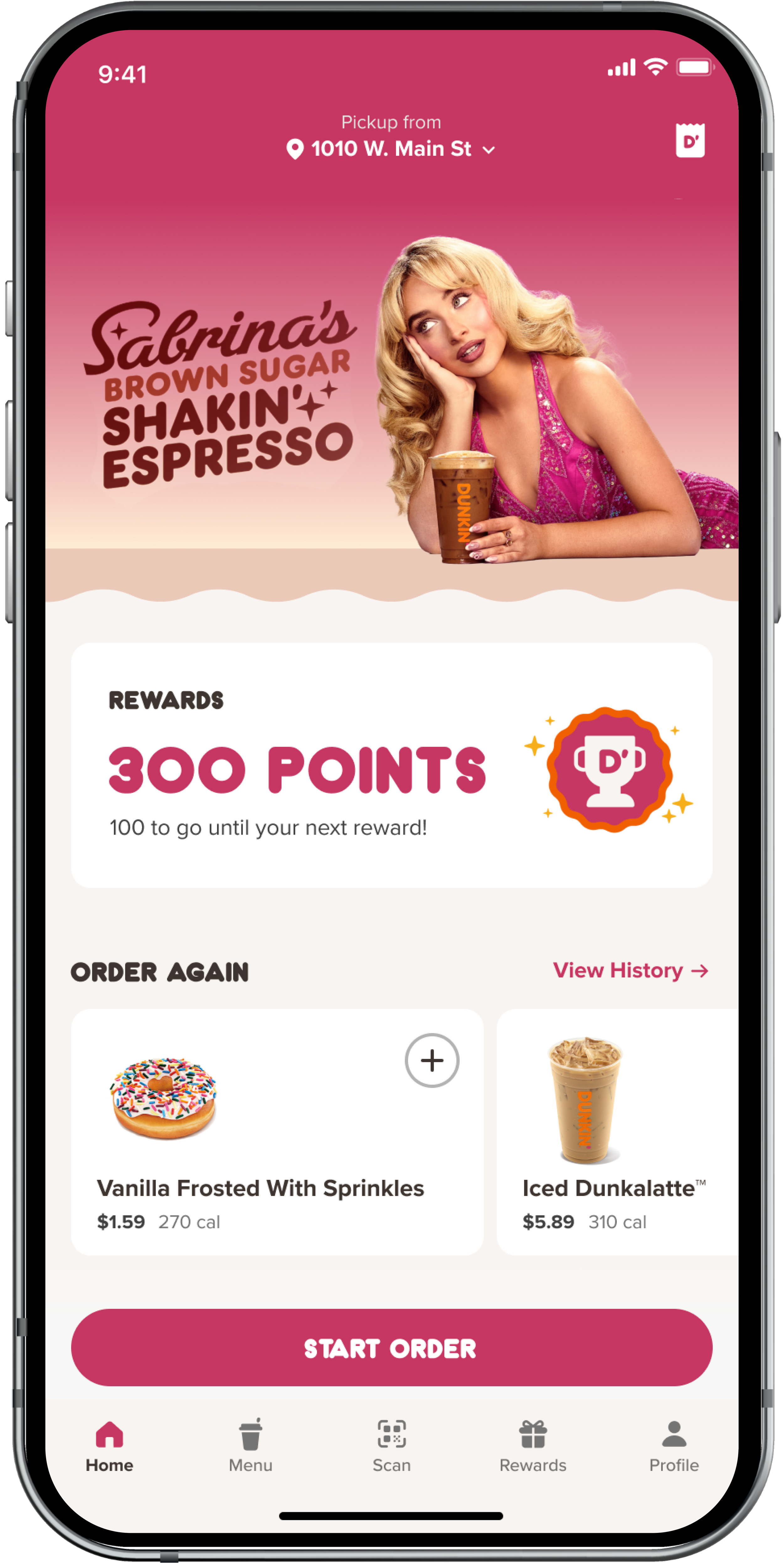
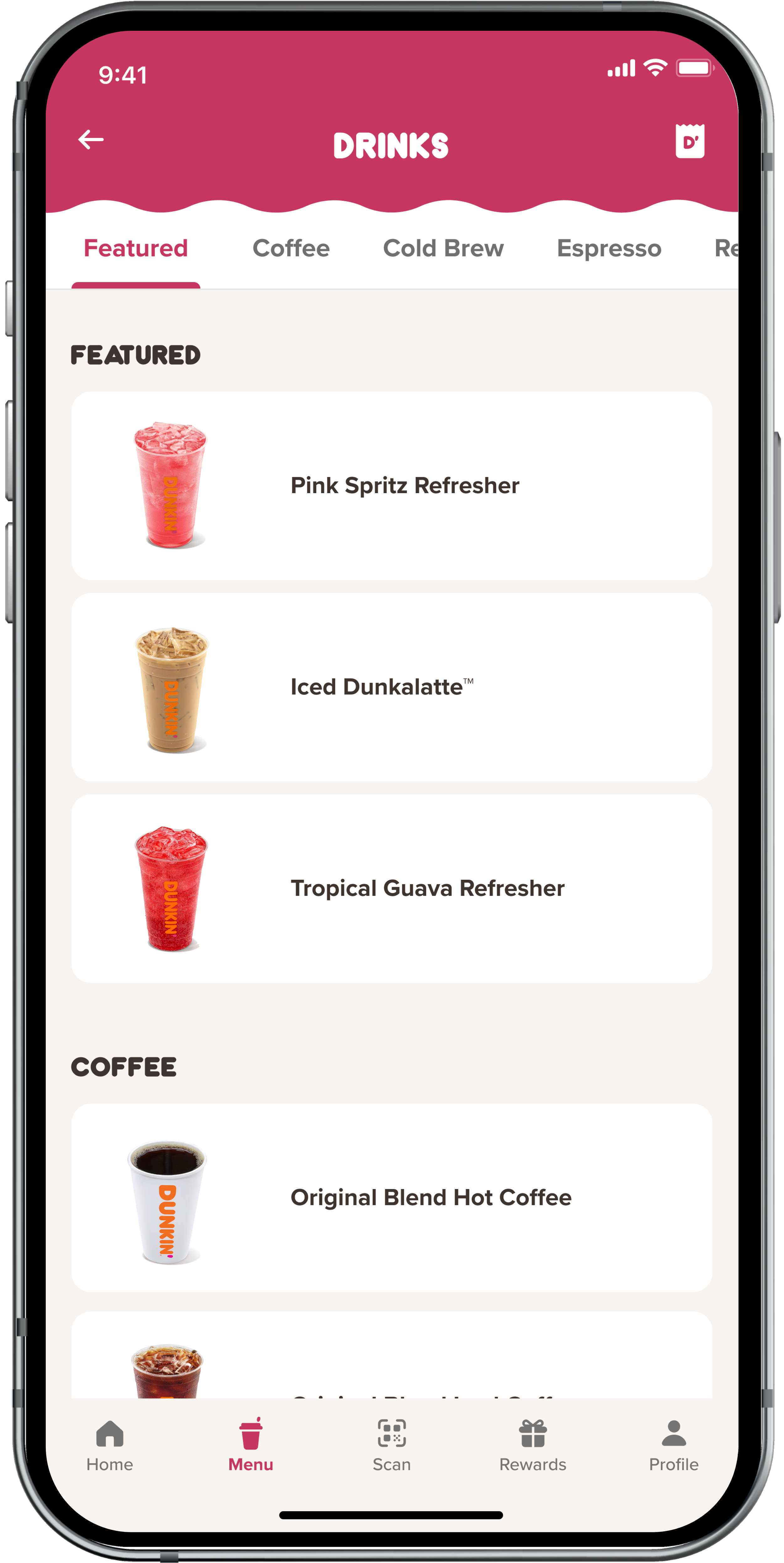
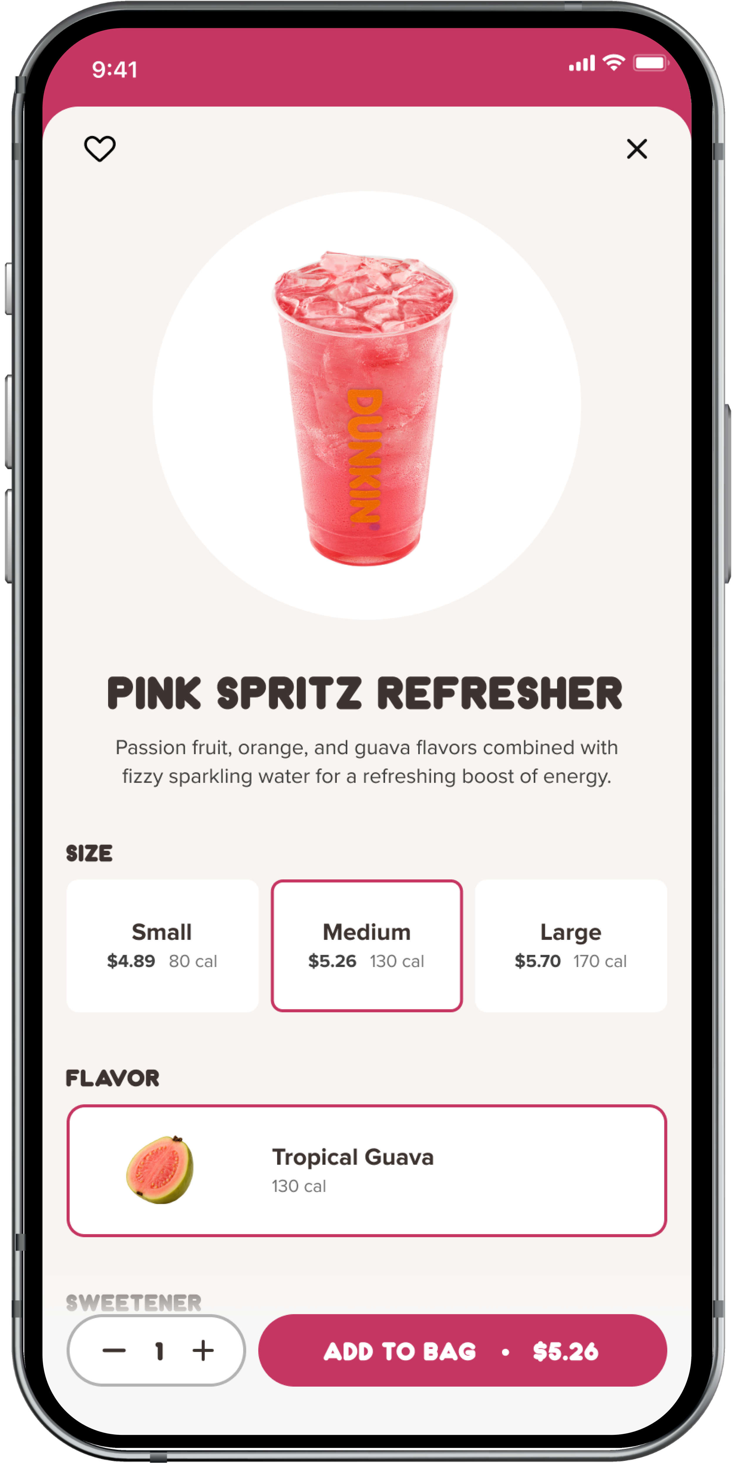
To pressure-test this, we translated the JJ's designs to the Dunkin' brand by updating only a handful of components: typography, colors, iconography, corner radii, and decorative elements. The result was a fully adapted experience that matched Dunkin's bubbly and youthful personality — without changing the underlying information architecture or interaction patterns. The home screen, menu categories, and PDP all translated cleanly, validating the framework's flexibility.
Outcome
The audit and redesign demonstrated enough value that Inspire Brands engaged our company for ongoing design work — a direct result of the clarity and quality of the UX & UI improvements.